Last time I measured what four models build when the brief says nothing about design. They converge, the palette follows your product category, and telling them to "be distinctive" strips the gloss without moving the design anywhere.
So: what does move it. Two interventions, same briefs, same four models, five runs each.
- forbid: name the four commonest patterns and ban them. "Do not use gradients of any kind. Do not use a dark background with a single bright accent colour. Do not use frosted-glass or blur effects. Do not use fully-rounded pill-shaped buttons."
- direct: one sentence pointing somewhere. "Take the visual direction from acid design, futuristic, digital, high-energy."
I said at the end of part 1 that one of these produces pages with no personality whatsoever, and that it's the one I expected to work. It's the ban, and it does exactly what I asked it to.
The ban is obeyed
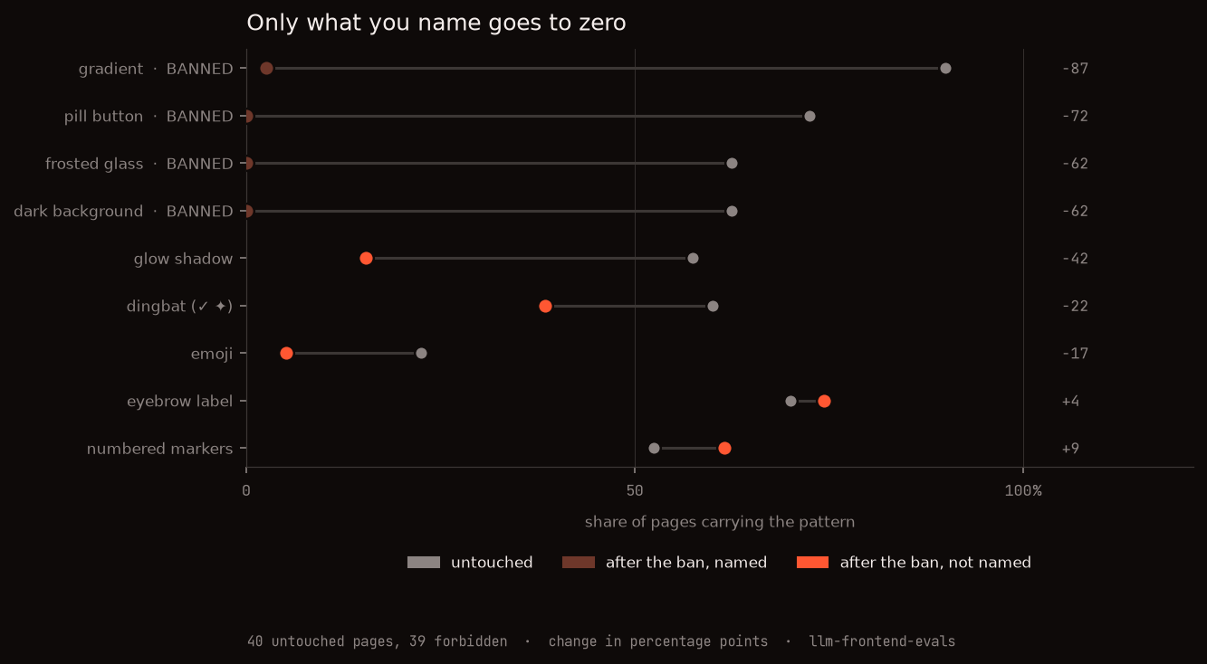
The four named patterns land at 0%, 0%, 0% and 3%. One page in 39 slipped a gradient through and that is the entire violation set. "Models are bad at negation" is not true here, at least for concrete visual features you can name.
Nothing I didn't name lands anywhere near zero either, with one honest exception: emoji fell to 5%, two pages in thirty-nine, without being mentioned. Everything else unnamed sits between 15% and 74%.
The patterns come in bundles
Look at glow shadow, though. It drops 42 points and I never mentioned it.
That makes sense once you notice a glow needs a dark background to be visible, and dark backgrounds were banned. But it turns out to be the general case, not a coincidence:
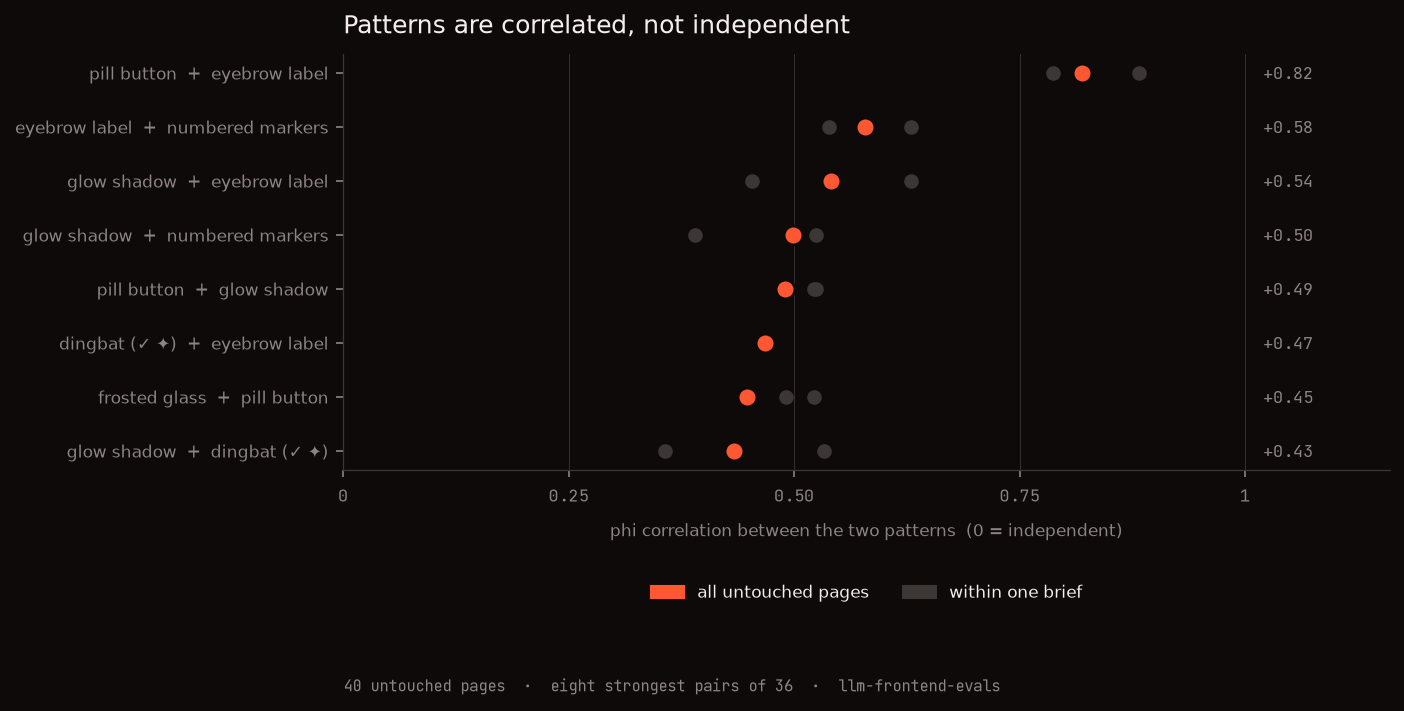
These features are not independent. A pill button and an eyebrow label have nothing to do with each other visually, one is a button shape and the other is a line of small caps, and they land on the same page 67.5% of the time. Their phi correlation is 0.82, and all eight of the strongest pairs sit above 0.4.
The obvious objection is that this is the product category showing through: dev tools are dark and glowy, back-office tools are rounded and light, so of course things co-occur. Splitting by brief doesn't collapse it. The grey dots are each brief's own value, 0.88 and 0.79 for pill and eyebrow, and the weakest of the sixteen is 0.36, nowhere near zero.
So an attractor isn't a feature, it's a package. Cut one strand and you pull the others, which is why a ban on four things reaches a fifth.
What you land on instead
Ban the package and the model doesn't run out of ideas. It picks up a different package and holds it just as tightly.
The two patterns that came through untouched are pure page furniture, an eyebrow label over a heading and numbered section markers, and both went up. Meanwhile every forbidden page is white, in both briefs, with a within-brief spread in background lightness of 0.009 and 0.012 (standard deviation). Tighter than any other condition in the experiment, and only the high-effort rerun of the same prohibition beats it.
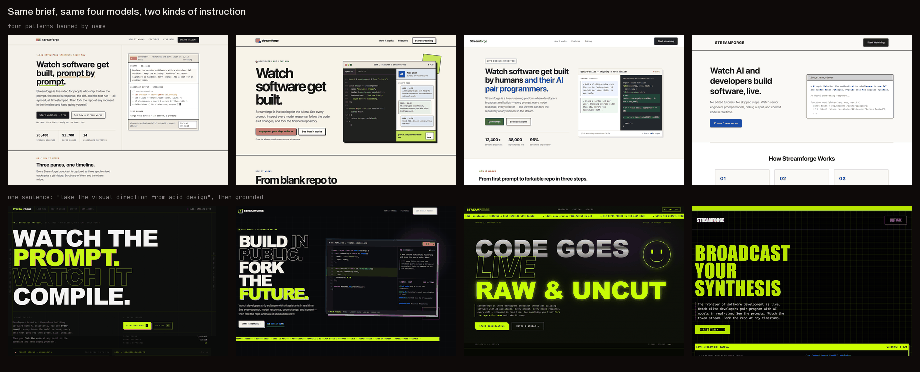
Top row is the ban. They're competent and they're interchangeable. I can't tell you which model made which, and neither could you.
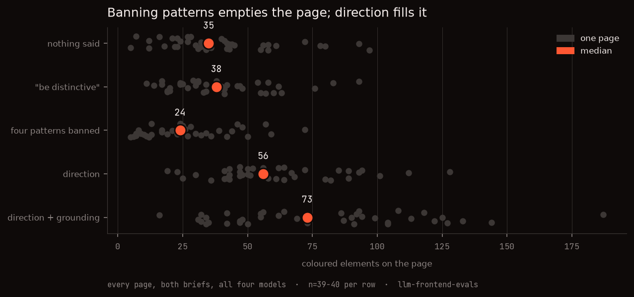
They're also the emptiest pages in the experiment: median 24 coloured elements against 35 untouched.
The category doesn't vanish here either, it relocates. The prohibition names background colour, so matching backgrounds prove nothing on their own. But under the identical ban, on identical white pages, the dev tool still carries twice the colour and two thirds the page length:
| dev tool | back-office | |
|---|---|---|
| coloured elements | 36 | 17 |
| share of elements rounded | 0.13 | 0.25 |
| page height, px | 2636 | 3913 |
Everything got quieter. Nothing got resolved.
Is that just the small thinking budget?
Reasoning is pinned low across this experiment, which leaves an obvious reading: a constrained model on a small budget takes the cheapest compliant path, and the white page is laziness rather than a destination.
So I ran the identical prohibition again with effort raised. Same prompt, byte for byte, one knob. It came out at 33 times the reasoning, a median of 2,060 tokens a page against 63, across 24 pages.
The palette doesn't move. Every page lands between 0.952 and 0.994, dark backgrounds stay at 0%, and the banned patterns stay gone. What the thinking buys is bulk: 84% more elements, 54% more colour, a fifth more page. The model builds a more thorough version of the same white document.
It's the attractor, not the budget.
What one sentence of direction buys
Now the other half.
Before writing any markup, the directed models were asked to say what the aesthetic actually is. Forty documents, median 717 words, written before a single tag. I expected four different guesses at a vague phrase.
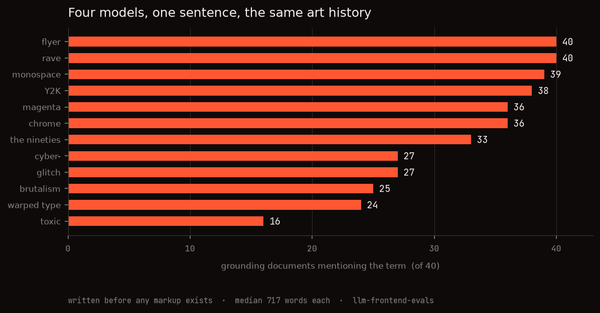
Every single document reaches for rave flyers. Thirty-nine of forty reach for monospace, thirty-eight name Y2K, thirty-six name chrome and thirty-six name magenta, and thirty-three place it in the nineties. Seven cite The Designers Republic by name. One of Claude's runs goes further and lists David Rudnick, Bráulio Amado, Studio Moross and the Pangram Pangram foundry.
They are not guessing. They are recalling the same movement:
Acid graphics are the visual residue of three lineages colliding. First, rave and jungle flyer culture of the early-to-mid nineties: photocopied, over-saturated, illegible-on-purpose, printed on cheap stock in fluorescent spot inks. Second, chrome-era 3D […]. Third, the anti-design / post-Swiss reaction of the 2010s […]
That's Claude. Here's GPT, unprompted by any of it:
Start with a near-black base—charcoal, ink, or a subtly tinted ultraviolet black—rather than pure black. Use a small set of synthetic accents at full intensity: toxic lime, electric violet, hot magenta, signal cyan, and occasional warning orange.
Which explains why the direction works at all. I wasn't asking for invention. I was naming a coordinate the training data holds densely, and four models walked to it from four different starting points.
And you can watch them arrive. Untouched, the accent hue is all over the place: across their ten runs each model reaches for three or four different hue families, so there is no single "favourite" to report. All forty untouched pages split green 15, purple 11, orange 11, magenta 3.
Directed, 32 of those 40 pages land in one family. Claude 8 out of 10, kimi and gemini 9, gpt 6. All four go 100% dark. Pages carrying a genuinely saturated colour, above 0.25 max chroma, go from 8% untouched to 70%, and coloured elements from 35 to 73.
The vendor fingerprint I spent half of part 1 documenting turns out to be about a finger's pressure of instruction deep. Not all of it: Claude still put an eyebrow label on 100% of its directed pages, exactly as it does untouched, while its pill buttons dropped from 100% to 10%. Gemini still refused eyebrows entirely. Direction overrode the palette and left the component vocabulary alone, which is exactly the split part 1 predicted.
One thing the numbers hide: that family is magenta, and the pages look green. My extractor takes the highest-chroma element as the accent, and on an acid palette the magenta beats the acid green that dominates the page.
Does the grounding step earn its turn?
Everything above is the grounded pipeline. The obvious question is how much of it
the grounding turn is doing, so: direct1 gets the identical sentence and goes
straight to HTML, no writing-it-down step.
| sentence only | sentence + grounding | |
|---|---|---|
| coloured elements | 56 | 73 |
| DOM elements | 142 | 197 |
| pages 100% dark | 78% | 100% |
| run-to-run spread in background | 0.052 | 0.018 |
Nearly three times tighter run to run, and a third more on the page.
The single clearest thing the grounding turn does is visible per model. Given just the sentence, GPT went dark on one of its ten pages; the other nine came back light. Given the turn to write down what acid design is first, it went dark on all ten. It isn't that GPT couldn't do acid design. It's that "take the visual direction from acid design" alone didn't reliably get it there, and four hundred words of its own prose did.
Peak saturation went slightly down with grounding, 0.276 to 0.256. Thinking first made the pages more considered, not more extreme.
The model is going to converge either way
Every condition here converges. Nothing said, banned, directed: each lands the four models in more or less the same place as each other, and the tightest convergence of the lot belongs to the ban.
So convergence was never the problem. The question is only ever who picked the destination.
Banning strips a layer. You peel off the package the model reaches for first and it settles onto the next one down, which nobody chose and which happens to be a white page with an eyebrow label. Direction names the destination, and because the destination is something the training data holds richly, one sentence is enough to move four models off four different defaults.
Which is why "make it less generic" has never worked for me, and I now know what it costs rather than just that it doesn't work. It's subtraction with no target. The slop leaves, exactly as instructed, and something equally fixed arrives to take its place.
What this doesn't show
- One direction, tested once. Every directed page here aims at acid design, and the grounding documents are the reason it worked: the models already hold a dense, shared account of it. A direction the training data holds thinly would be the real test and I haven't run it.
- "High effort" is not one treatment. At the same setting kimi spent 5,690 reasoning tokens a page and gpt spent 336. The comparison holds across all four, but the knob plainly means different things to different vendors.
- Reasoning is pinned low everywhere except that one A/B, so the direction results have not been checked against a bigger thinking budget.
- The format bans Tailwind, same as part 1, same caveat.
- 39 forbidden pages, not 40. One cell never completed, twice, and the
harness raises rather than writing a partial row, so the failure is described
in the code and not in the published
runs.jsonl.
Harness, all 263 pages, the grounding documents and every measurement: antithetical-labs/llm-frontend-evals.