I gotta confess: I have no design training and a pretty utilitarian taste, so when I need a UI I just ask a model and then squint at it until I am satisfied. Lately I've been squinting more. The output has a sameness to it that I can spot and couldn't describe, which is annoying, so I measured it.
Spoiler for the whole post: the pages are good. Genuinely better than what I'd put together by hand. They're just all the same page. Which shouldn't surprise anyone, because a model reaching for the most likely next token is going to reach for the most likely design, and "be distinctive" is not a direction you can point that at. Distinctive isn't a thing you can be. It's a thing you can be towards.
The setup
Four models, all through OpenRouter on one key, mostly so I wouldn't have to babysit four billing dashboards:
- Claude Opus 5
- GPT-5.6-sol
- Kimi K3
- Gemini 3.1 Pro
Every model gets the same two briefs, and these stay fixed for the whole series:
- Streamforge, a dev tool. Live-streaming platform where developers broadcast themselves building software with AI assistants. Viewers watch the prompts, the model's output and the code evolve in real time, and can fork any stream's repo.
- Backlot, a back-office tool. Brand-deal contracts, invoices, sponsor deadlines and per-platform payouts for full-time content creators who are not finance people.
Two of them, rather than one, to separate what a model always does from what the product pulls out of it. Short version: the palette flips, the components don't.
Output format is pinned everywhere: one self-contained HTML document, all CSS in
a single <style> block, no frameworks, no build step, and a fixed set of
sections. Six prompting conditions, five runs each. 240 cells, 239 completed,
$44.39.
Harness, raw pages and every measurement: antithetical-labs/llm-frontend-evals.
This post is the first two conditions: saying nothing, and saying "avoid generic AI aesthetics."
What does a model do when you say nothing?
The briefs don't mention colour, type or layout. Not once. Here's the background lightness of all 40 untouched pages:
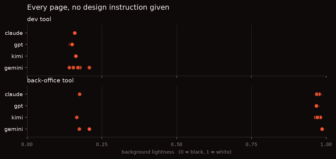
So it's not a dark mode preference. It's genre retrieval: dev tool means dark, back-office tool for non-technical people means light and editorial. The model looks up what your category is supposed to look like and ships that. Confident as hell about a product it met ninety seconds ago.
The copy converges too. Nineteen of twenty dev-tool headlines open with "Watch", and three vendors independently wrote a sentence within one word of "Watch software get built, prompt by prompt." That one's on me though: my brief says "Viewers watch the prompts", so the word was already sitting there. The back-office headlines, no such verb in their brief, share zero words across models. Still funny how far a single word drags the copy behind it.
Do the four models actually differ?
Genre sets the palette. Underneath that they're pretty different. Coral is the model's own rate, grey is the four-model average behind it:
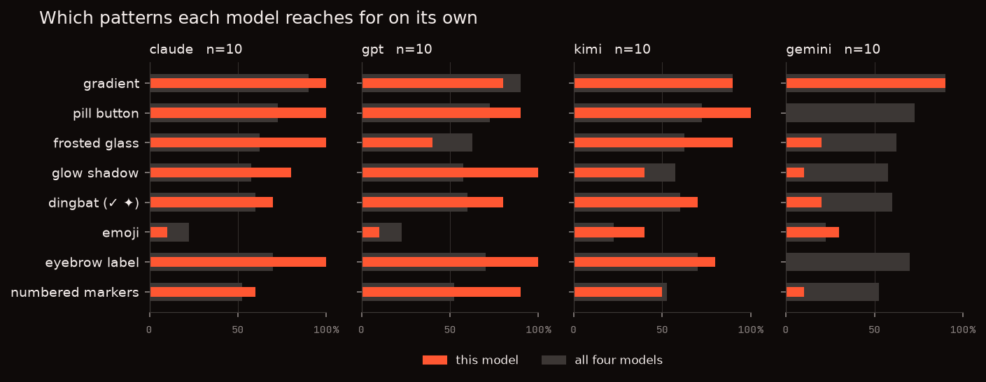
Gradients are universal, ~90% everywhere. Everything else splits:
- Gemini just doesn't do eyebrows. That little uppercase kicker above a heading: 7 of its 60 pages. The other three run 55 to 58 out of 60.
- Gemini won't make a pill button either. Zero out of ten. Claude and Kimi are at 100%. Somewhere in that post-training there is an opinion about border-radius.
- Claude cannot leave a surface alone. Gradient, frosted glass and pill on 100% of its untouched pages.
- Kimi is the only one that reaches for a serif headline, and only sometimes (3 of 10).
- Page weight varies 3x. Gemini's median page is 88 DOM elements. GPT's is 261.
Which is the actually useful bit here. If you switch models and the output feels different in a way you can't name, this is it. The palette follows your product no matter who you ask. The component vocabulary is your vendor's.
So there isn't one most likely page. There are four, one per vendor. Each of them still only has the one, though.
Is the slop checklist still right?
There are real lists for this, not just vibes. pbakaus/impeccable ships 59 detector rules and opens by naming the tells directly: "Inter for everything, purple-to-blue gradients, cards nested in cards, gray text on colored backgrounds, the rounded-square icon tile above every heading." MindStudio's design-system post adds blue or indigo accents, rounded-full pills, 50px padding everywhere, drop shadows, glassmorphism and gradient hero sections.
Six of those I can measure. Scorecard:
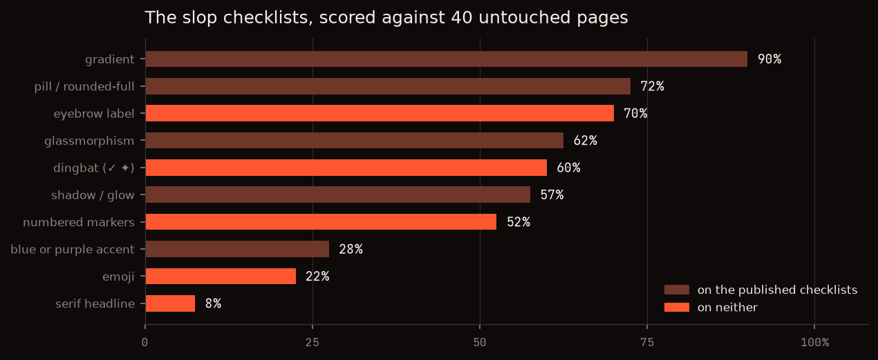
On texture they're dead right. Gradient 90%, pill 72%, glassmorphism 62%, shadow or glow 57%. No notes.
On colour they're stale. "Blue or indigo as the primary accent" lands on 28% of pages. Green and acid are the biggest group at 38%, red and orange next at 32%. Purple-to-blue was probably correct whenever those lists were written. Acid green has moved in since.
Which is the structural problem with ban lists. The mode moves. Whatever was most likely last year got written down, and by the time it's a rule the models have drifted somewhere else. You're always describing the previous convergence.
The font one I can't score fairly, and I want to be upfront about it: my output format required a system font stack, so I discouraged Inter myself. 30% of pages put it in the stack anyway.
Then there's the half nobody names. Eyebrow labels 70%, dingbats 60%, numbered section markers 52%. Not on either list.
The dingbat row is my favourite. 60% of untouched pages have a ✓ or a ✦ in
the markup, mostly ticking off feature bullets. Real emoji are way rarer at 22%.
I nearly shipped these as one number, which would have published the
checkmark's frequency under the rocket's name.
Here's one page carrying nearly all of it:
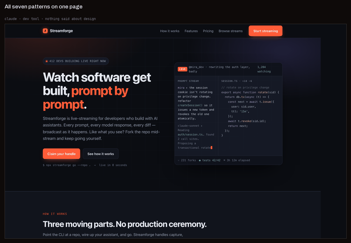
Three eyebrows ("BUILT FOR PEOPLE WHO SHIP", "HOW IT WORKS", "OPEN BETA"), pill buttons, a glass card over a gradient, a glow on the accent, three numbered steps, checkmarks down the feature list. Accent is orange, not indigo. Run it past a detector looking for purple-to-blue and it comes back clean.
As my own sidenote, I originally recorded zero rounded corners across all 239 pages. Great line. Completely wrong: I was taking the median corner radius over every large element, and only ~10% of large elements are rounded, so the median never sees them. Rounding is sparse, not absent.
That one had a second life, which is the more useful lesson. The classifier in the next section tests for "zero border-radius", and it was testing it with that same median. So the check passed on every page in the run, and the bucket that was supposed to mean broadsheet quietly became a catch-all holding 65 pages, some of them 45% rounded. A dead measure doesn't just give you one wrong number. It gives you every number computed downstream of it, and those look fine.
Does "make it distinctive" do anything?
Obvious next move: just tell it not to. The folk remedy, in the wording people actually use, is "avoid generic AI-generated aesthetics, make it distinctive." I appended exactly that and ran the 40 pages again.
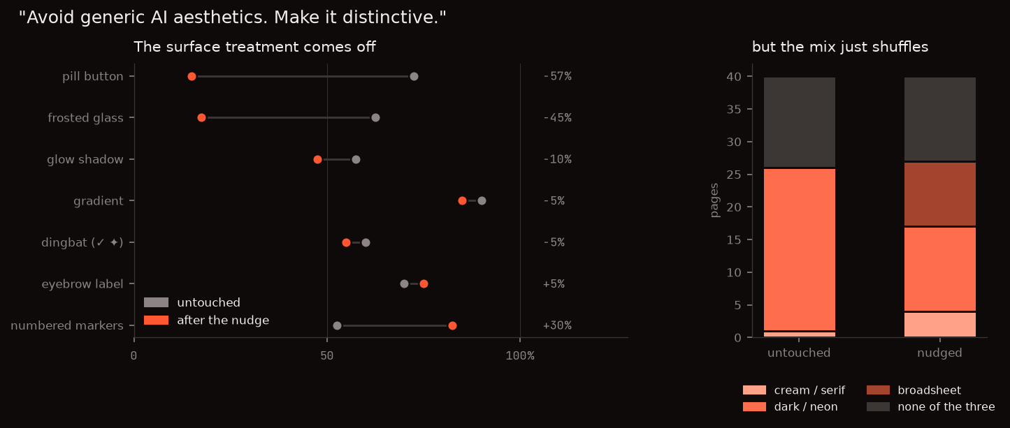
The polish comes off hard. Pill buttons drop 57 points, frosted glass 45.
The right panel needs a word of setup. Anthropic ships a frontend-design skill
with Claude that names three looks AI design falls into: cream-and-serif,
near-black-with-one-bright-accent, and broadsheet. I classified every page
against those three.
The nudge trades between them and doesn't get you out. Dark-and-neon halves, 25 pages down to 13, and broadsheet picks up 10 of the 12 it loses. The number sitting outside all three barely moves: 14 untouched, 13 nudged.
That list is missing one, though. Every near-white back-office page is hairline-ruled and dense but has rounded cards, which is the opposite of broadsheet, so it matches none of the three. That's just the ordinary light SaaS look, and it's most of what the second brief produces.
Two things go up. Numbered markers +30 points, eyebrows +5, median DOM elements 124 to 173. Told to be distinctive, every model added more stuff. "Be distinctive" parses as "add something."
Same model, same brief, one sentence of difference:
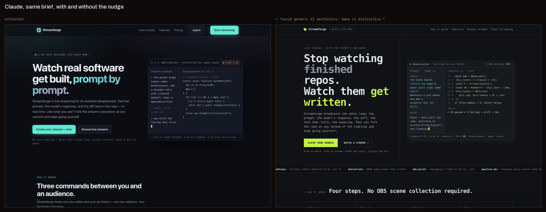
Still dark. Still one bright green accent. Buttons went square, glass card gone, type went mono, and there's a strikethrough gimmick in the headline. It looks different. It doesn't look like a different decision, it looks like the same decision with the gloss sanded off.
Which is about what I'd expect. Telling a model what not to do is a constraint, and a constraint narrows the distribution without moving it. You get the same design with fewer features on it. Removal is not direction.
And this is the whole thing, I think. None of these models is bad at design. They build a clean, competent, well-spaced page every single time, which is more than I manage. What they can't do is be distinctive on request, because distinctive means "away from the mode" and nothing in the prompt says which way. Ask for the most likely page and you get it. Ask for a less likely page and you still get the most likely one, minus the pill buttons.
What this doesn't show
- Reasoning is pinned low on every model. At default settings one model burned 16k tokens thinking before writing a single tag and another took under a minute. Uncontrolled variable, not a feature.
- Plain HTML and CSS only, no Tailwind, no React. Utility classes push colour and spacing into class names and a framework's default scale, which is the exact thing I'm measuring. Most real frontend work happens in Tailwind, so this is a deviation from practice and I'd rather say so.
- Two briefs separate genre from model. They don't characterise a genre. Everything above about dev tools going dark rests on exactly one dev tool.
- One cell never finished, dying identically twice at 16,380 bytes with three reported completion tokens. Left it as a gap.
Next up, the obvious follow-up: if vague negation does nothing, does a specific one work? I banned the four patterns by name, and separately gave one sentence of actual direction to aim at. One of those produces pages with no personality whatsoever. It's the one I expected to work.